Case Study · Website / UX & UI Design
Kimelo.
A clear, conversion-focused digital experience for an AI-powered eCommerce platform built for foodservice distributors.
Responsive by design
Client
Kimelo
Role
UX/UI Designer
Platform
WordPress
Scope
Home · About Us · Features · Pricing & Contact
The Brief
Designed to convert, built to scale.
Kimelo needed a professional web presence that could communicate the depth of their AI-powered platform to foodservice distributors — an audience that values clarity, trust, and real-world proof over flashy animations.
I designed the complete website — Home, About Us, Our Platform (Features), and Pricing — handling the UX/UI, photo selection, layout, and copy direction. The site was built on WordPress for easy internal updates by the Kimelo team.
Visual Direction
Brand System
Color Palette
A dark-mode-first palette that conveys technological sophistication while feeling approachable. Deep navy creates a premium, enterprise-grade feel — while indigo and periwinkle bring energy to CTAs without looking generic.
Deep Navy
#0B1121 · Primary background
Royal Blue
#6366F1 · Accent & highlights
Soft Periwinkle
#818CF8 · Links & hover states
Kimelo Orange
#F97316 · CTAs & key actions
Pure White
#FFFFFF · Typography & cards
Slate Gray
#64748B · Body text
Typography
Area — a modern geometric sans-serif with sharp, confident letterforms, used for both headlines and body. Bold weights give headlines authority; regular weight keeps feature descriptions easy to scan — ideal for dense B2B content without feeling cramped.
Aa Bb Cc
Area — headlines & body
The smarter way to run foodservice.
Body copy stays clean and highly legible, even in data-dense sections like features and integrations.
Photography & Illustration
I deliberately selected aerial warehouse shots, delivery trucks, and logistics imagery to anchor the brand in its audience's daily reality. Custom illustrations for feature sections add warmth and explain complex workflows without relying on generic stock photography.
Imagery principles
- Real logistics environments over abstract tech visuals.
- Custom illustrations to explain AI workflows simply.
- Product screenshots as proof, not decoration.
The Pages
Page by page.
01 — Home Page
First impression, built for trust.
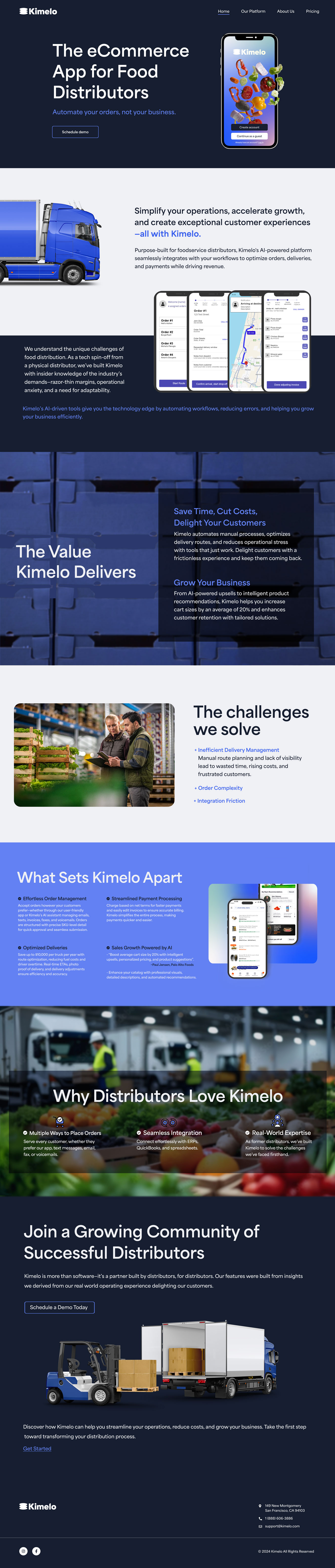
The homepage communicates Kimelo's value proposition immediately — an eCommerce app for food distributors, built by industry veterans. A bold hero with a clear CTA leads into a structured breakdown of benefits, testimonials, and a final community-focused CTA.
- Dark hero with product screenshot creates instant credibility — visitors see the platform before scrolling.
- Truck and warehouse imagery signals “built for your industry” at a glance.
- Testimonials from real distributors add social proof without feeling forced.
- “Join a Growing Community” closing section drives demo signups.
02 — About Us
Real people, real expertise.
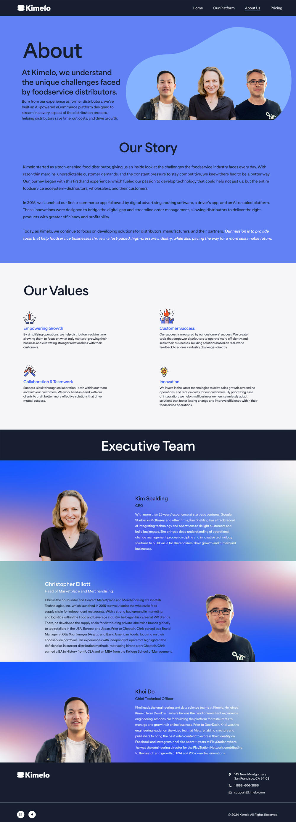
The About page tells Kimelo's origin story — a tech spin-off from an actual food distributor. The layout highlights the founding team prominently, paired with the company's mission, values, and executive bios.
- Team photo collage creates an immediate human connection before any copy.
- Alternating left-right bio layouts create visual rhythm and prevent monotony.
- Executive credentials (Google, DoorDash, Meta, PlayStation) establish technical weight.
- Our Values section uses icon cards to make corporate values feel tangible.
03 — Our Platform
Complex product, clear communication.
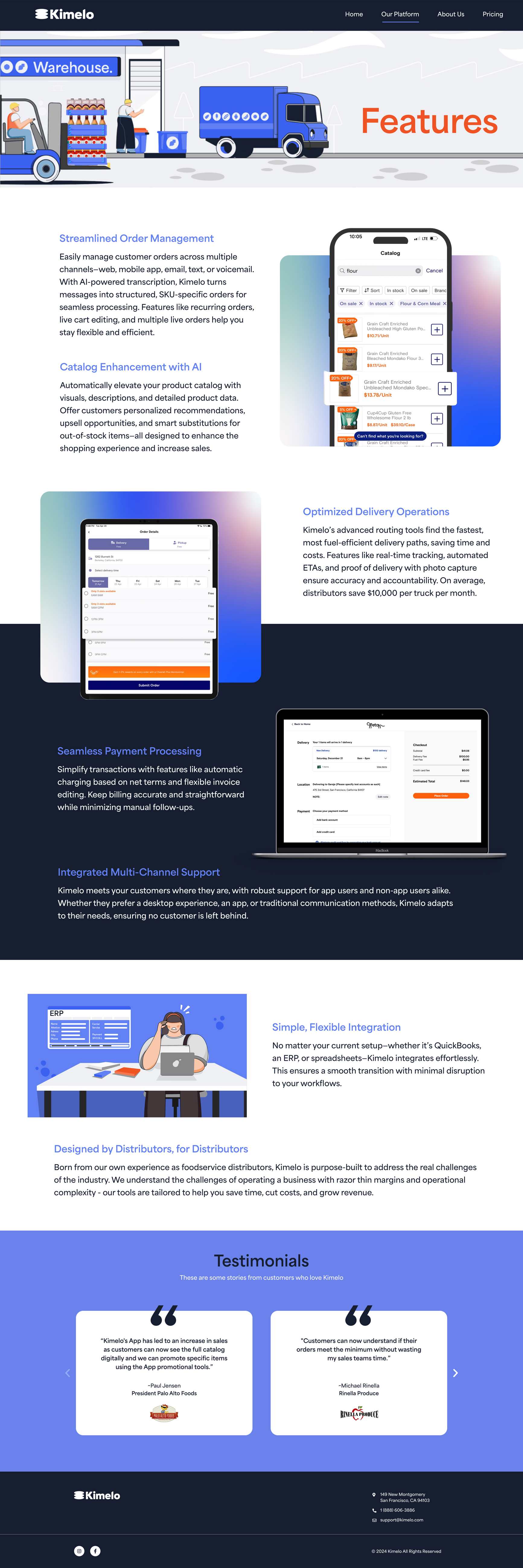
The Features page was the biggest design challenge — translating a multi-feature AI platform into something digestible. It's structured as a scrolling narrative where each feature pairs an illustration or app screenshot with a concise value statement.
- Custom illustrations for each feature section (orders, delivery, payments) add personality.
- App screenshots embedded inline show the real product — not just marketing promises.
- Feature-benefit pairing: every capability ties to a time or dollar savings metric.
- Integration section reassures prospects they won't abandon their current tools.
04 — Pricing & Contact
Low friction, high intent.
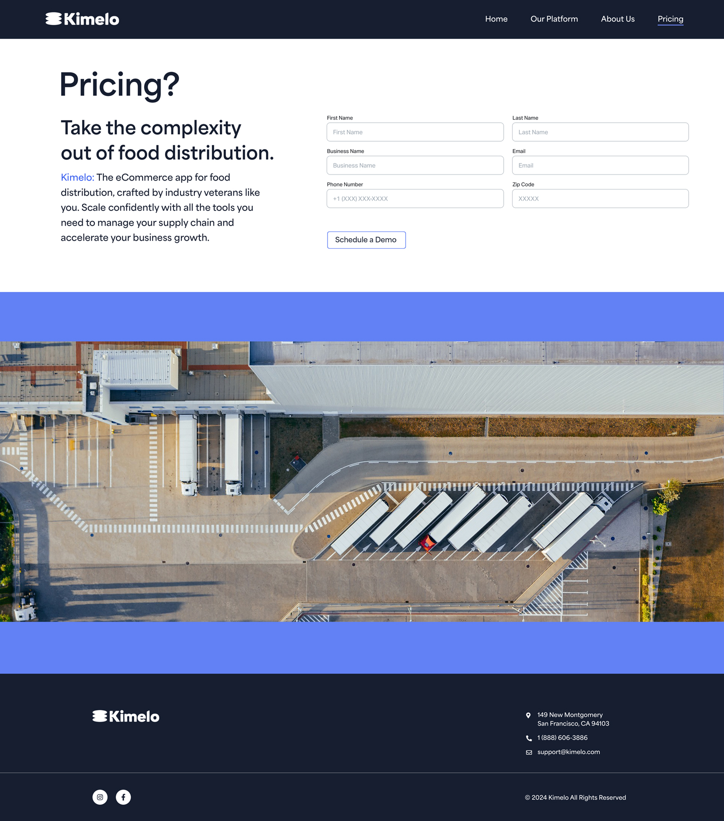
Rather than fixed pricing tiers, Kimelo's consultative sales model requires a demo-first approach. A clean contact form qualifies leads without creating friction, paired with industry imagery that reinforces context.
- Minimal form fields reduce abandonment while qualifying leads.
- “Schedule a Demo” CTA is action-oriented — not the generic “Submit” that kills conversion.
- Full-width aerial warehouse photo grounds the page in Kimelo's industry.
- Dark footer with contact details and social links closes the experience professionally.
Responsive Design
Every screen, covered.
Designed mobile-first, the site adapts seamlessly across breakpoints — navigation collapses into a clean menu, content reflows to single-column layouts, and touch targets are sized for real fingers.