Back to web design
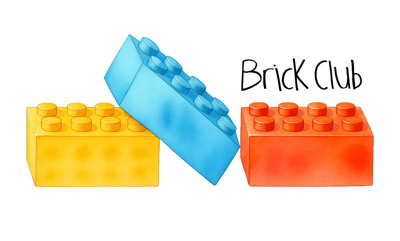
Brick Club logo

Case Study · Branding & Website / UX & UI

A LEGO library run by kids, designed for kids.

Brick Club is a lending library for LEGO sets: borrow a set, build it, send it back, get a new one. I designed the brand and the website — including a small inventory portal simple enough for its 8-year-old founders to browse and for a parent to keep stocked.

Visit brick.club

Client

Brick Club — a family in Mill Valley, CA

My role

Brand identity · UX/UI · Website design

Platform

WordPress

Scope

Logo · Home · Library · FAQ · Shop · Sign Up

The Brief

My client was a family — and the ideas came from the kids.

Two brothers wanted their LEGO sets to keep going on adventures instead of collecting dust, so they started a club that lends sets to other kids. My job was to translate their ideas — sketched, spoken and sometimes acted out — into a real identity and a working website, without sanding off the personality that made the idea theirs in the first place.

The UX Challenge

The interface is this simple on purpose: the users are kids around 8.

Every decision here was measured against one question: can an eight-year-old do this alone, on the first try, without reading much? That ruled out filter panels, multi-step carts, account dashboards and any word longer than the ones kids already use. What is left is a shelf of big pictures and one obvious button per set.

Picture first, words second

Kids scan images, not labels. Set photos are the largest element on every card, with names and ages in short, readable lines underneath.

One action per screen

Reserve. Swap. Join. Never two competing buttons — the primary action is always the biggest, most colourful thing in view.

No dead ends

Reserved sets stay on the shelf, greyed out and labelled, so a child never wonders where their favourite went.

The grown-up gate

Anything involving email, money or delivery is handed to a parent through a clearly marked step, keeping kids in the fun part.

The Other User

An inventory portal a parent can run in ten minutes a week.

Behind the shelf there is a real library to manage. The person running Brick Club needed to add a set, upload a photo, write two lines, mark it reserved or available and put it back in circulation — without touching a page builder or calling me. So the whole back end is one content type with a handful of fields and a status toggle that the public library reads directly.

  • Add a set: photo, name, set number, age range, two-line description
  • Status toggle — Available, Reserved, Coming Soon — reflected instantly on the shelf
  • Categories double as the public filter chips, so tagging is the only curation step
  • Reservation requests arrive by email with the set and the member already attached
  • No training document needed: the form mirrors the card the kids see

Identity

From a kid's sketch to a real mark.

The logo started as drawings by the founders — bricks stacked, bricks stacked differently, bricks with a name scribbled across them. I kept the honest, hand-drawn wordmark and rebuilt the bricks as three clean primary-colour pieces in perspective, so the mark reads as a child's idea executed with adult craft.

Typeface

Cera Pro — geometric, round and friendly, with generous counters that stay legible at the large sizes young readers need.

Colour System

Brick Blue

#0055BF

Navigation & primary actions

Stud Yellow

#F5C518

Play zones & highlights

Classic Red

#D01012

Reserve & key CTAs

Baseplate Green

#4CA64C

Footer & confirmations

Paper White

#FFFFFF

Cards & reading surfaces

Soft Grey

#EDEDED

Section backgrounds

The Pages

Five screens, one rhythm.

01Home

One story, told in three steps.

The homepage had to explain a borrow-build-swap model to a kid in seconds and to a parent in one scroll. I led with the promise — Marin County's first kid-directed LEGO community — then repeated the loop as a four-word rhythm: Build. Play. Swap. Repeat.

  • Hero answers what it is, how it works and what it costs before any scroll
  • Brick-edge dividers act as visual chapter breaks instead of plain sections
  • A featured row of three sets pulls live from the same inventory as the library
  • A dedicated "even if a brick disappears" block removes the biggest parent worry
brick.club
02Library

The shelf, browsable by an 8-year-old.

This is the heart of the product. Kids scan by picture first, so every set is a large photo with a short, plain-language description and one single action. Category chips replace filters and dropdowns — no multi-select, no sliders, no hidden state.

  • Card = photo, name, set number, age, two lines of copy, one button
  • Chips for Friends, Technic, Vehicles, Worlds and more — one tap, no menus
  • Reserved sets stay visible and greyed instead of disappearing, so nobody hunts
  • Returning members swap with one email field, no password to remember
brick.club
03Sign Up

A kid picks, a grown-up confirms.

Membership involves money, so the flow splits responsibility. The child chooses the set and types their first name; the site then asks for a grown-up's email and sends the real signup there. The kid never faces a payment screen.

  • Short, single-column form with large fields and generous tap targets
  • Kid-facing step and grown-up step are visually separated and labelled
  • Plain-language confirmation — what happens next and when it arrives
brick.club
04FAQ

Answers written for two readers at once.

Parents ask about hygiene, missing pieces and billing; kids ask how long they can keep a set. I wrote every answer short enough to read aloud and grouped them so a parent can skim while a child looks for their one question.

  • Questions phrased the way people actually ask them out loud
  • Missing-piece policy front and centre — the club's most reassuring promise
  • Accordion keeps the page short on mobile without hiding the categories
brick.club
05Shop

Merch drawn in the club's own hand.

The shop sells tees printed with the same illustrated characters that appear across the site, so the merch reads as an extension of the brand rather than a generic print-on-demand add-on. It also funds new sets for the library.

  • Product photography styled on the brand's flat, primary-colour backgrounds
  • Same card rhythm as the library, so the shop needs no new learning
  • Illustrations reused from the site, keeping one visual voice throughout
brick.club
Previous · HeadlandsNext · ShiftDebrief